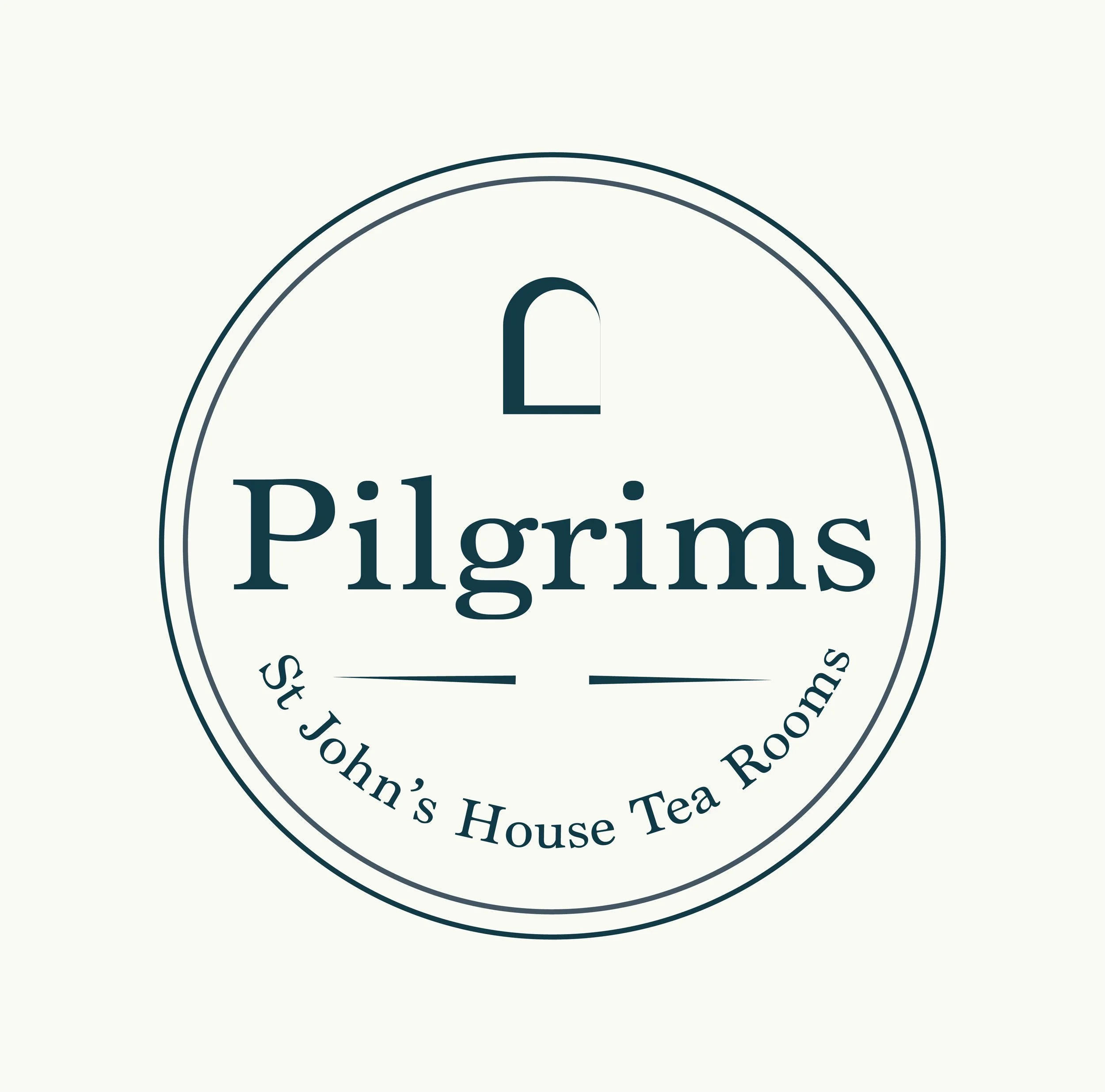
Pilgrims Tea Rooms spans St John’s and a new tea room in an old historic house, rooted in traditional British hospitality. The challenge was to extend an existing identity while naming and shaping the new space so it felt cohesive yet true to its setting.
Through an on-site visit and research into heritage-inspired design, the direction focused on capturing the atmosphere of the space. The final identity balances timeless charm with approachability, creating a consistent experience across both locations.
PILGRIMS TEA ROOMS
PROJECT: Visual Identity Design
DELIVERABLES: Branding/ Logo/colourways
TIMELINE: 5-6 Weeks
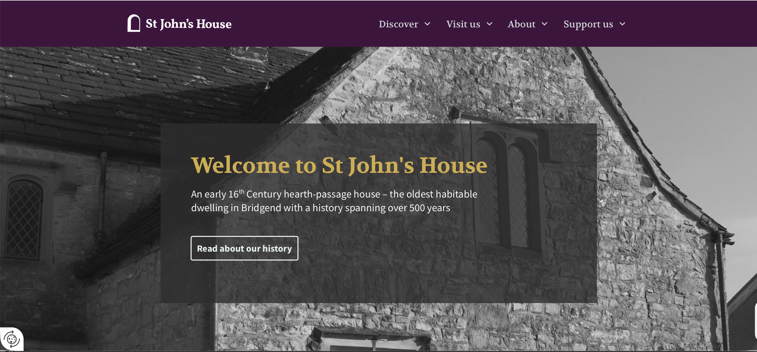
The key design challenge lay in extending an existing identity rather than starting from scratch. St John’s House already had an established logo, which set the tone for the brand’s heritage and character. The task was to develop a visual identity for the New Tea Rooms that felt distinctly its own, while remaining clearly connected to and consistent with St John’s House.
This required careful consideration, ensuring the Tea Rooms branding complemented the original logo without mimicking it, and creating a cohesive experience across both locations. The challenge was to strike a balance between continuity and individuality, preserving the integrity of the existing brand while expanding it in a way that felt natural, unified, and true to the shared atmosphere.
Connected Spaces
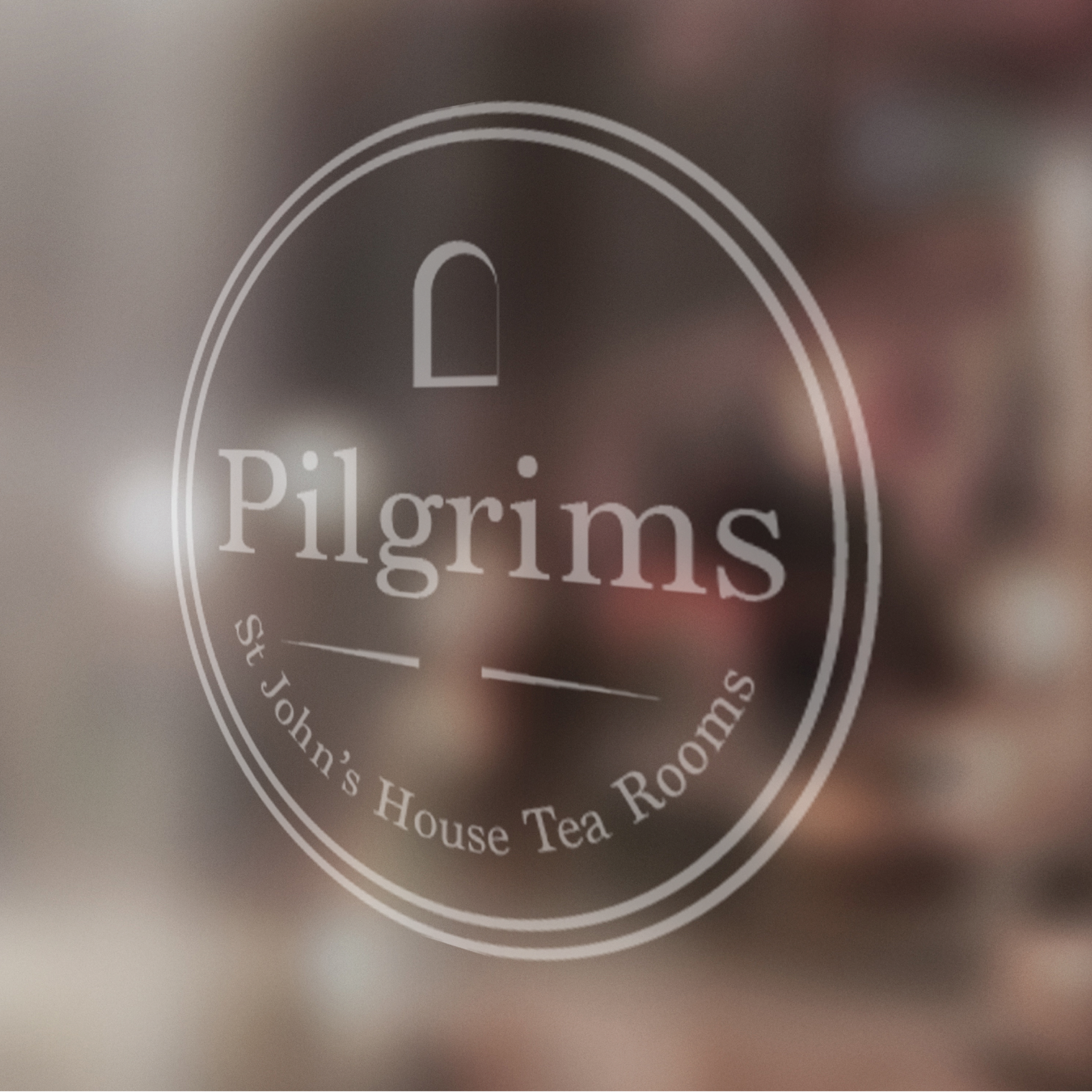
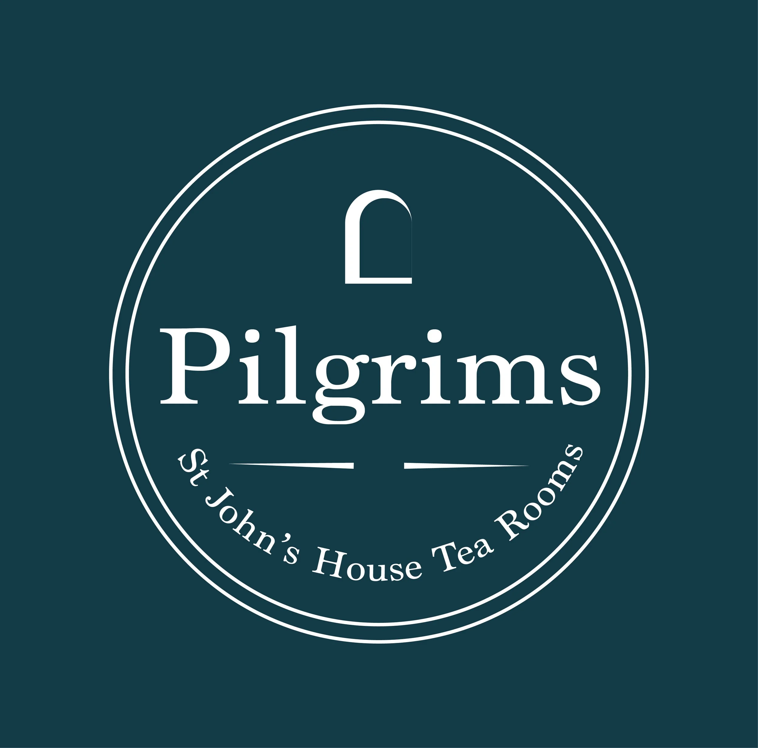
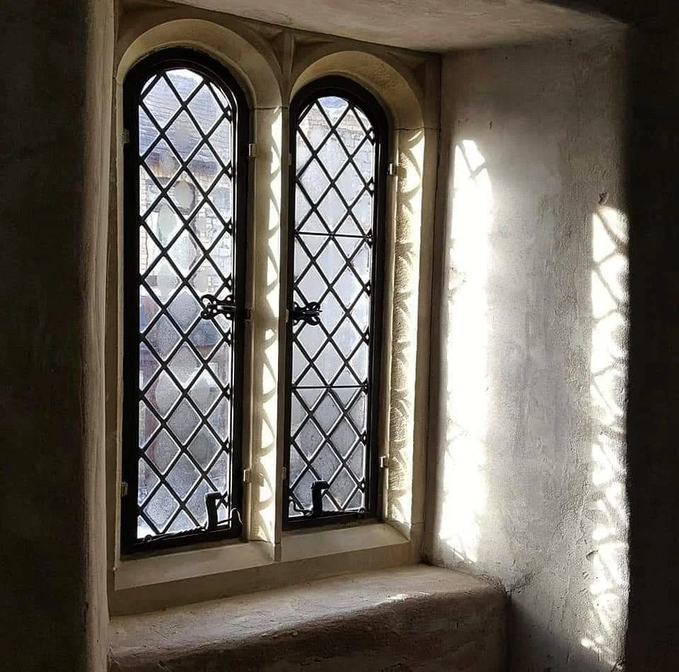
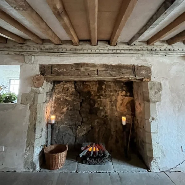
The creative direction was guided by the idea of quiet heritage, creating a brand that felt naturally rooted in place rather than imposed on it. It needed to sit comfortably within the atmosphere of a historic house while staying connected to the existing St John’s identity, so every decision focused on balance, restraint, and continuity.
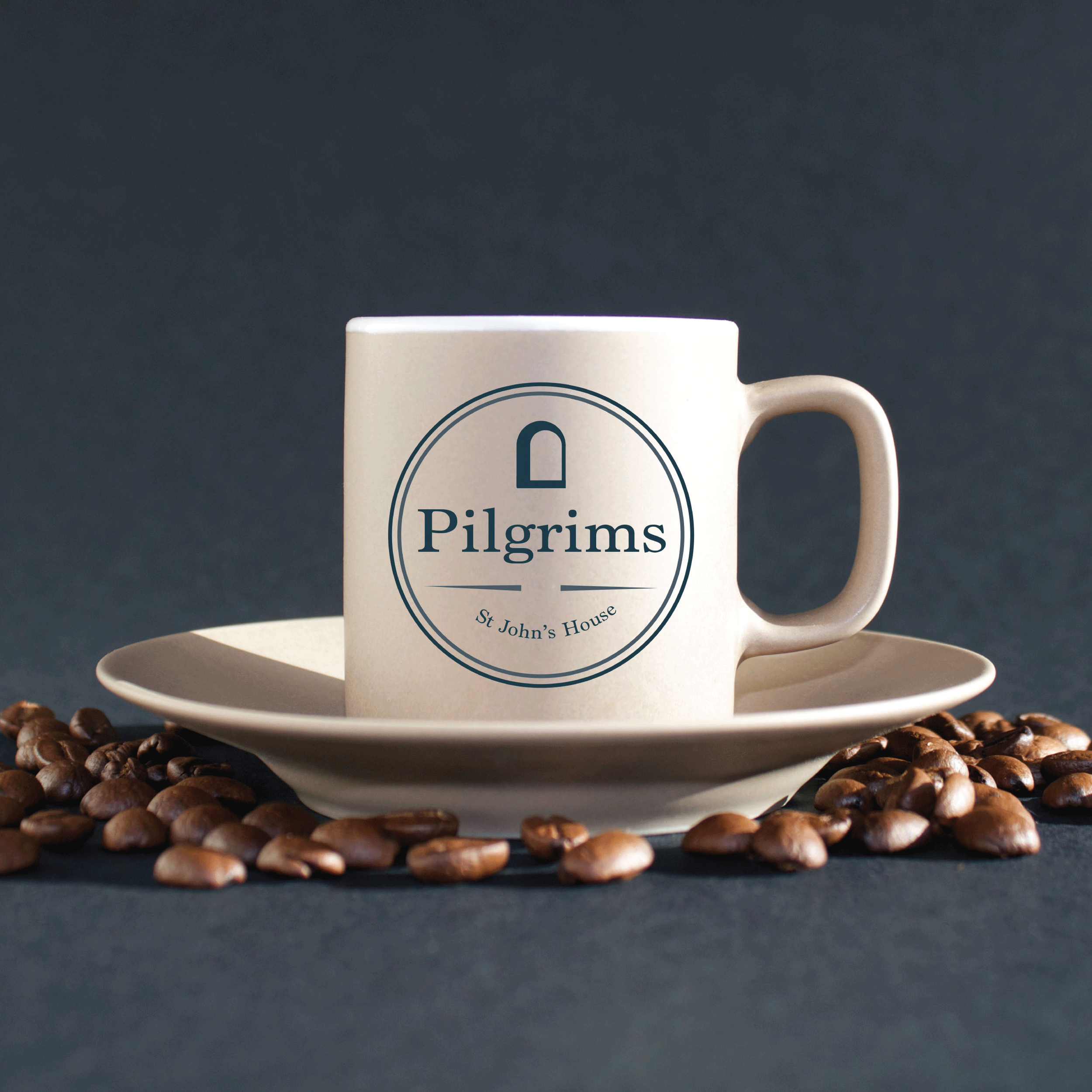
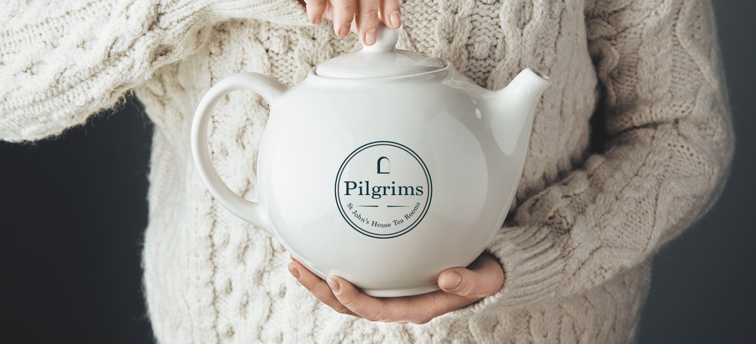
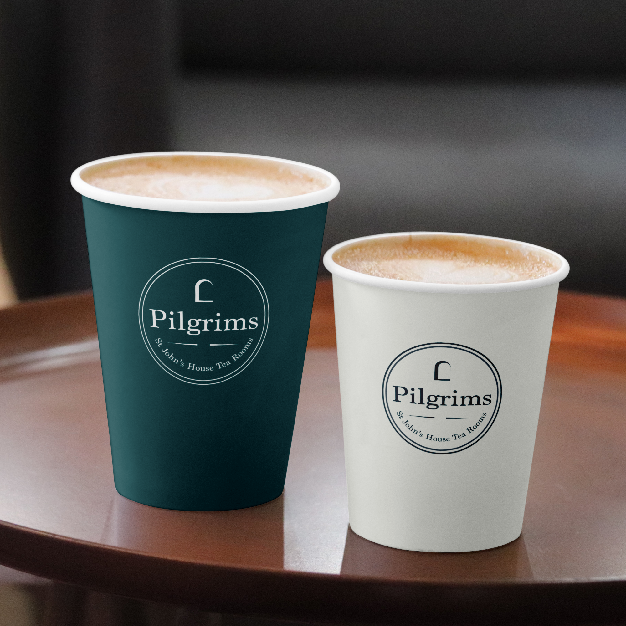
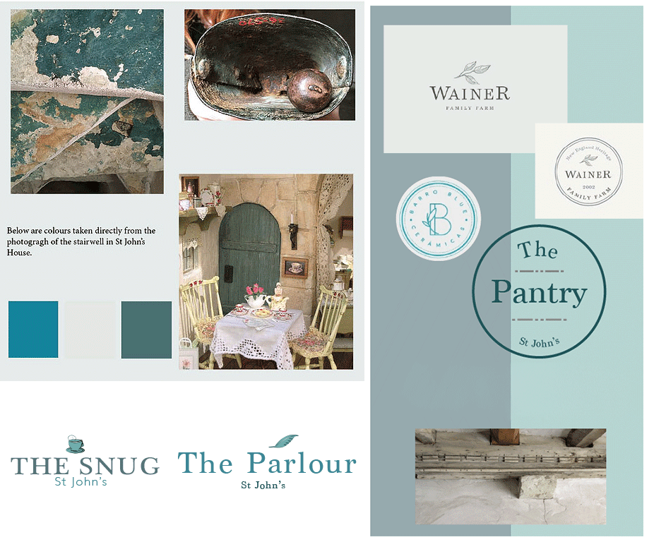
Visual inspiration came from traditional British tea culture and understated hospitality cues, translated into a soft, refined system. The colour palette was built from gentle teals drawn directly from the patina of the old bell at St John’s house, paired with an off-white to enhance calmness and breathing space throughout the identity. Typography followed the same thinking: a characterful serif to bring warmth and heritage, supported by a clean, simple typeface for clarity and ease of use. Layouts were kept structured and minimal to let the environment and experience lead, resulting in a calm, cohesive identity that feels both grounded in history and quietly contemporary.
Quite
Heritage